What font options are available for custom badges?
Choosing the right font style helps your badge not only look good, but be legible, timeless, and consistent with your department or unit’s visual identity.
Font styles we offer
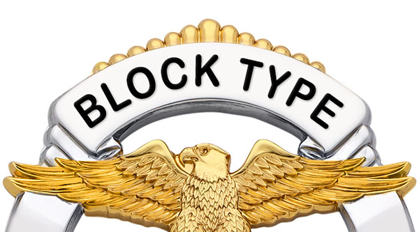 |
Block – Clean, straight lines without decorative elements. Good for modern look, easier readability, especially on bold text or smaller panels. |
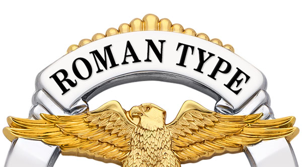 |
Roman – Decorative “feet” or tails on letters, with thinner and thicker strokes. Offers a more traditional, formal appearance; adds character but generally requires more space. |
How to choose the right font
- Look at your current badge — if you’re updating or reordering, check your existing font: do letters have serifs or look more traditional? Matching that helps maintain consistency.
- Consider the layout and text length — longer department names or many lines often work better with Block font due to fewer decorative strokes.
- Style vs formality vs visibility — Roman fonts appear classic; Block fonts are easier to read from a distance or under low-light conditions.
- No cost difference — The font choice doesn’t add to the base cost; the trade‑offs are more about aesthetics and readability than price.
What to avoid or be cautious about
- Avoid placing very small text in Roman font if space is tight — serifs and fine strokes can blur or look cramped.
- Watch spacing — some letters like “I”, “l”, “t” etc. appear very close in Roman fonts; avoid manually adding spaces to compensate.
- Be consistent — once you pick a font for your department, reuse it for future badges to maintain uniformity in appearance.
Related topics
- What materials and finishes are used for custom badges?
- What enamel types are available?
- Design your badge now →
Still unsure what font matches your needs? Contact us — we’re happy to review your badge style and help pick the best font for visibility and aesthetics.
FAQ Category